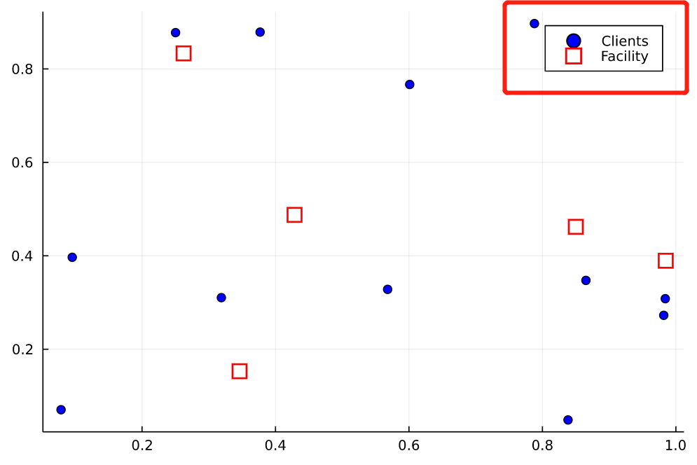
import Plots
import Random

Random.seed!(314)

# number of clients
m = 12
# number of facility locations
n = 5

# Clients' locations
Xc, Yc = rand(m), rand(m)

# Facilities' potential locations
Xf, Yf = rand(n), rand(n)

Plots.scatter(
    Xc,
    Yc;
    label = "Clients",
    markershape = :circle,
    markercolor = :blue,
)
Plots.scatter!(
    Xf,
    Yf;
    label = "Facility",
    markershape = :square,
    markercolor = :white,
    markersize = 6,
    markerstrokecolor = :red,
    markerstrokewidth = 2,
)
画图效果如下,其中图例两行距离太近,而且标识符与图中实际大小不一致,如何调整图例显示效果?